Veteran Suicides Poster. 18"x24" 2021.
And spreads for an NPR article titled:
"Since 9/11 Military Suicides Are 4 Times higher Than Deaths in War Operations."
And spreads for an NPR article titled:
"Since 9/11 Military Suicides Are 4 Times higher Than Deaths in War Operations."
Concept:
Poster
After diverging many iterations on the poster, I wanted the mood to be, overall, an empathetic one. With such a dark and heavy subject, so much imagery paints exactly that--potentially turning away a good portion of an audience. It was important to speak to the empathetic parts of the human response.
With the figure being toned unrealistically, and postered in a bowed position with face buried in hands, an audience can come from a perspective of observance and care, as opposed to shock or fear, for example.
"30,177 Suicides" is hand-lettered to resonate a more humanistic type, rather than something synthetic or stale. Using a premade font may have taken away from the more humanistic portrayal. Overall, the had-lettered copy gives its message a voice.
The warped stripes in the background continue the flow and pattern of the figures striped shirt, as well as serving as a more subtle iconography of the U.S. flag.
The accompanying copy in the bottom margin is placed next to a marker of the Colonel insignia. This is intended to reinforce that the subject is about U.S. veterans.
Spread 1
The first spread is introduced with the image of the American flag half-mast, as is utilized to symbolize respect and mourning.
The tone not only mirrors the tone of the figure from the poster, but is intended to mute the otherwise heavy red tones a realistic depiction of the flag would have projected. It's also intended to portray the somber reality, and to not give mixed-messages, such as patriotism, for example, that a standard American flag portrayal could potentially evoke. (This is not anti-patriotism--just intended to neutralize possible mixed messaging).
Hand-lettering is continued on the back of the service-member in the other image on the next page.
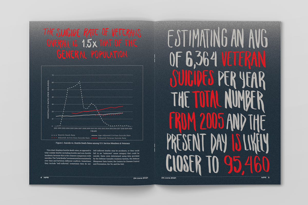
Spread 2
The graph, and the inescapable, general tone of data-heavy imagery, is balanced by the use of additional hand-lettered type. The message on the second page offers two messages--where the red type is driving the message straight to the alarming facts.